Mobile only continues to grow more important every year.
Google’s recent rollout of a mobile-first index only emphasizes this point. It also helps to reinforce the notion that mobile SEO is deserving of a significant amount of marketers’ time and strategic efforts.
The differences between a user landing on a desktop landing page and a mobile landing page are crucial to consider.
Users behave differently across multiple devices, and that behavior must be taken into account when it comes to optimization.
In order to really prioritize the ever-increasing usage of mobile devices for search, it is wise for marketers to ensure that a company’s site has landing pages designed specifically for mobile.
Simply making a “mobile-friendly website” is just not good enough.
There are many things to consider when optimizing for mobile landing pages, but there are a few that continue to stand out over the years and also grow in importance as well.
1. Get to the Point Fast
You have a ridiculously limited amount of time to grab a user’s attention.So it’s imperative to place the most relevant messaging that you want users to see in front of them as quickly as possible.
This becomes even more important with mobile, where space is limited due to size constraints of devices.
If a user isn’t captivated by what they see on the screen, they will quickly move on.
Ensure that the most important information is prioritized so that visitors can find it fast.
2. Content Placement & Length
Again, screen size is crucial.The amount of real estate you have to grab a user’s attention or direct them toward what you would like them to look at is significantly minimized on mobile devices in comparison to desktop.
If there is a notable call-to-action you are trying to entice the user to engage with, then it is absolutely critical to place this somewhere it can be seen, without scrolling, on a smartphone.
Also due to size constraints, it’ important to think about how much content is displayed.
Overloading a mobile landing page with large blocks of text can potentially reap havoc on click-through rates.
The content should be clearly organized in a way that the user can easily understand, and they should be guided to the meat of that content.
Graphics can also help guide users to this, in place of large chunks of text that are not as fitting for smaller screen sizes.
3. Easy-to-Use Navigation
Navigation should essentially be intuitive.If a user cannot easily find the primary navigation in order to get from one place to another on their device, they have a much higher chance of bouncing.
A home page link and other significant buttons should be easily viewable and accessible.
Keep in mind, though, that on landing pages you want to limit the number of navigation options a user has in order to direct them to the desired action that you want them to take.
4. Scalable Across Multiple Device Types
There are hundreds of device types out there – Apple, Android, and Windows, among others.All have various sizing constraints and specifications.
Creating a mobile landing page that works across all of these can be a challenge.
That is one of the reasons why it is particularly important to have a responsive website that can display the page accurately across multiple devices.
5. Avoid Pinch to Zoom
Simply put, a user should not have to zoom in on their phone in order to see your website content.It has been proven that users oftentimes do not prefer to have to either zoom or scroll for long amounts of time in order to view the content that they are trying to get to.
Make it easy for a user – display the most critical content at an appropriate size and above-the-fold for mobile so that they can easily get to what they want.
6. Aesthetics
A proper look and feel can make all the difference.Be selective in the choice of fonts, color schemes, etc.
This is arguably even more important on mobiles, where the scope of viewability is more limited.
You must cue your readers with effective design aesthetics as to what content is important in order to get them to take the action that you are wanting them to take.
7. Page Speed
If you aren’t paying close attention to page speed load times on a site, you could potentially lose a large amount of users quickly.A page that loads slowly only causes users to become impatient and bounce off the site.
No one wants to sit and wait for content to load on their device.
One of the common items that affect load time that people overlook is images.
They should be scaled appropriately so that they can fit on the screen, and also be compressed to reduce their size.
8. Geo-Targeting
A user’s location can be determined within a range of about 5-20 miles thanks to GPS on smartphone devices.Using an IP address, a user’s location details can be calculated, including their country, region, ZIP code, or metro area.
This can be an advantage particularly for brick-and-mortar stores, which could edit particular mobile landing pages based on a user’s location and add some personalization this way.
9. Effective CTAs
The purpose of a mobile landing page should be clear. It should also be compelling and entice a user to take action.Ensure that that action is visible and stands out to the user.
Do this using compelling graphics and a concise layout, and limit the options a user has.
For instance, if a user can click to access social profiles, share the page, submit a form, have a menu expand, expand, they are being presented with more options, which decreases the likelihood that they will take the action you are wanting them to take.
10. Always Be Testing
A/B tests have been used frequently, and due to extra size constraints of mobile, they can be even more helpful.The only way to know if any of the above tips are effective is to test them.
Try changing one attribute at a time and see what really works.
For example, swap out a graphic or reposition a CTA and analyze the results to see if it made a difference. You can then use those results to help guide any future iterations of a page.
Conclusion
When it comes to mobile, you have even less space, and arguably less time in some scenarios, to really grab a user’s attention and guide them to take an action.It is critical to separate the mobile and desktop experiences and understand how users’ behavior varies between the two in order to optimize for conversions.
Reference:https://www.searchenginejournal.com/optimize-mobile-landing-pages/250661/?ver=250661X3






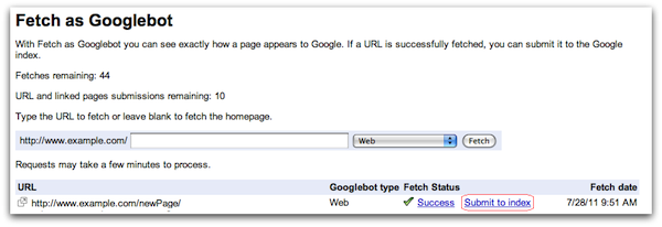
 If you have launched a new website, updated a single page on
your existing domain, or altered many pages and/or the structure of your
site, you will likely want Google to display your latest content in its
SERPs.